Loading...

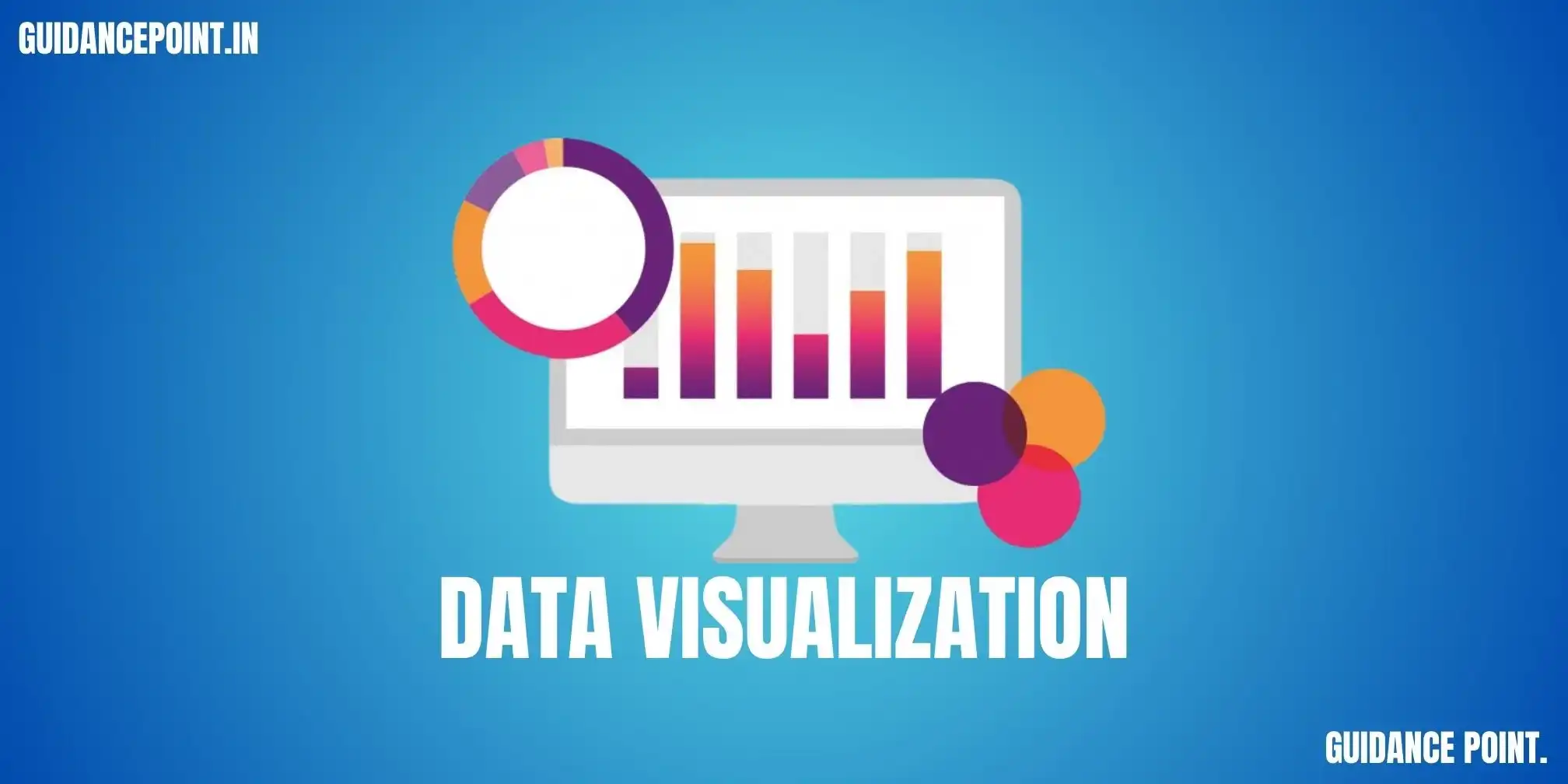
Best Data Visualization in Data Science Training

Welcome to our comprehensive Data Visualization training in Pune, where we explore the importance of effective data visualization techniques in analyzing and communicating insights from complex datasets. Data Visualization in Data Science plays a crucial role in the data science workflow, allowing us to explore data, identify patterns, and present findings in a clear and compelling manner. Whether you're new to data visualization or looking to enhance your skills in creating impactful visualizations, our Data Visualization training in Pune is designed to provide you with the knowledge and practical experience needed to excel in the field of data visualization. Ready to unlock the power of data visualization and take your data analysis skills to the next level? Enroll in our Data Visualization training in Pune today and embark on a journey towards becoming a proficient data visualization practitioner.


Data Visualization in Pune

What will You learn in Data Visualization training in Pune?

  1. Principles of Data Visualization: Understand the fundamental principles of data visualization, including encoding, perception, and design principles.
  2. Exploratory Data Analysis (EDA): Learn how to use data visualization to explore datasets, identify trends, and uncover insights.
  3. Data Visualization Libraries and Tools: Explore popular data visualization libraries and tools such as Matplotlib, Seaborn, Plotly, and Tableau.
  4. Static and Interactive Visualizations: Create static and interactive visualizations using different techniques and tools to effectively communicate insights.
  5. Dashboard Creation: Learn how to design and create interactive dashboards to present complex data in an easy-to-understand format.
  6. Customizing and Styling Visualizations: Understand how to customize and style visualizations to enhance readability and visual appeal.

Why choose our Data Visualization in Data Science training?

  1. Comprehensive Curriculum: Our coData Visualization training in Pune covers all the essential topics and techniques you need to know to kickstart your journey in data science, from data wrangling and exploratory analysis to machine learning and statistical modeling.
  2. Hands-On Learning: Get hands-on experience with real-world datasets and practical projects that reinforce your understanding of key concepts and techniques, and develop the skills needed to tackle real-world data science challenges.
  3. Expert Instruction: Learn from industry experts and experienced data scientists who bring real-world insights and expertise to the classroom, and receive personalized guidance and feedback throughout your learning journey.
  4. Flexible Learning Options: Our Data Visualization training in Pune is designed to accommodate learners of all levels, from beginners to experienced professionals looking to upskill, with flexible scheduling options and self-paced learning resources to fit your busy lifestyle.

Who is this Data Visualization training in Pune for?

  1. Aspiring Data Scientists: Individuals looking to start a career in data science and gain the foundational knowledge and practical skills needed to succeed in the field.
  2. Business Professionals: Professionals in fields such as marketing, finance, and healthcare who want to leverage data science techniques to drive business insights and decision-making and stay ahead of the curve in their industries.
  3. Students: Students studying fields like computer science, mathematics, or statistics who want to supplement their academic studies with practical skills in data science and gain a competitive edge in the job market.

Syllabus of Data Visualization in Data Science Training

  • Understanding the importance of data visualization in data science
  • Exploring the key principles of effective data visualization, including encoding, perception, and design principles
  • Learning how to choose the appropriate visualization types based on the data and the insights to be communicated
  • Exploring different types of visualization techniques: Bar charts, line charts, scatter plots, histograms, etc.
  • Understanding when to use each visualization technique based on the characteristics of the data and the analysis objectives
  • Hands-on exercises to practice selecting the right visualization techniques for various scenarios
  • Introduction to exploratory data analysis (EDA) and its role in the data science workflow
  • Using visualizations to explore and analyze datasets, identify patterns, trends, and outliers
  • Hands-on exercises to perform EDA with visualizations using tools like Matplotlib and Seaborn
  • Exploring advanced visualization techniques, including interactive plots and dashboards
  • Learning how to create interactive visualizations using tools like Plotly and Bokeh
  • Designing and building interactive dashboards to present complex data in a user-friendly format
  • Understanding the principles of geographic data visualization
  • Exploring techniques for visualizing spatial data using maps and geographic information systems (GIS)
  • Hands-on exercises to create geographic visualizations using libraries like Folium and GeoPandas
  • Learning best practices for designing effective visualizations, including principles of color theory, typography, and layout
  • Understanding how to customize and style visualizations to enhance readability and visual appeal
  • Hands-on exercises to apply design principles to create visually appealing and informative visualizations
  • Understanding the importance of storytelling in data visualization
  • Learning how to use visualizations to tell a compelling data story and communicate insights effectively
  • Hands-on exercises to practice data storytelling with visualizations and create impactful data-driven narratives

Contact Us

Career Opportunities in data science

Frequently Asked Questions

    Yes, at Guidance Point, we offer a dedicated course in Data Visualization as part of our comprehensive data science program. This course focuses on techniques and tools for creating compelling visualizations to communicate insights from data effectively.

    While a basic understanding of programming languages such as Python and familiarity with data manipulation and analysis concepts can be helpful, there are no strict prerequisites for enrolling in the Data Visualization course. Our instructors tailor the curriculum to accommodate students with varying levels of experience.

    Our Data Visualization course is seamlessly integrated into the data science curriculum, offering dedicated modules that cover topics such as data visualization principles, tools such as Matplotlib and Seaborn, interactive visualizations using libraries like Plotly, and best practices for creating effective visualizations.

    Absolutely. Practical application is a key component of our Data Visualization course. Students have the opportunity to work on hands-on projects and assignments that involve creating various types of visualizations, from basic charts to interactive dashboards, using real-world datasets.

    Yes, our Data Visualization course is designed to equip students with a comprehensive understanding of Data Visualization principles and techniques. By the end of the course, students should feel confident in their ability to effectively communicate insights from data through visually appealing and informative visualizations.

Data Visualization in Data Science Training

Download SYLLABUS


JOB ORIENTED COURSES
  • 12+ FULL STACK COURSES
  • 12+ DATA SCIENCE COURSES
  • 10+ SAP TRAINING COURSES
  • 18+ COMPETITIVE TRAINING


Courses At Guidance Point
  • FULL STACK DEVELOPER COURSE
  • DATA SCIENCE TRAINING COURSE
  • 10+ SAP TRAINING COURSES

Guidance Point provide wide range of course in multiple domains with 44+ training courses with some of them with job assistance.